Turning the Tables on Data Science
- Roger Kennett
- Jun 18, 2024
- 3 min read

How wonderful to see the new NSW Stage 4-5 Syllabuses are featuring data science skills. It is vital to nurture skeptical and data-savvy students able to withstand the vortexes of misinformation and the resulting social fracturing.
So maybe it is also time to reconsider something so "natural" for us that it might just slip under our critical analysis...
I'm talking about how we teach students to record and present experimental data.
Evaluate the two ways of students presenting bivariate data:
I get that Table 1 encourages students to calculate an average.... but why? Why lose all that wonderful data to condense it to a sterile average - there is a reason they call it mean :) Sure, we can add standard deviation or some measure of spread - but that's another whole abstraction and unnecessary cognitive load that graphing can deal with intuitively. In fact, graphing is the best way to introduce the ideas of centrality and spread and correctly lay the groundwork the scientific concept of reliability.
With Table 1, even if we did graph all the trial columns, as soon as we ask the spreadsheet to create a trendline, it will be for one trial only (experiment with this for yourself - it can look like a trendline for the whole data - but it is not!)
Secondly, it is typical in science to collect a whole raft of bivariate data without needing to repeat the exact same value of the independent variable. The whole idea of "trials" becomes meaningless when we consider each bivariate point is data that contributes to the model (the trendline is the empirical scientific model). Consider using video tracking software to measure the position versus time of a golf ball projectile. If you capture at 100 frames a second instead of 10 then you have more data that you can use to estimate your reliability, to evaluate your confidence in the trends you observed.
You compared the two tables, now compare the two graphs they lead to:
Which one tells a richer data story?
Which one would be best to begin a conversation about reliability?
Which best demonstrates the value of collecting more data?
Which shows that the students have actually collected 9 datapoints?
In which one can an outlier be included, but not weighted as strongly as an average does? (why deleting outliers could be teaching scientific fraud)
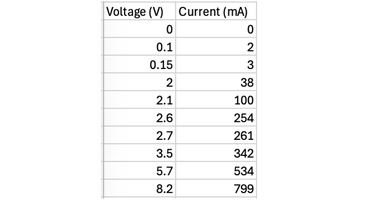
Table 1 implies a status for a "trial" (repeating a measure with an identical x-value) that it does not deserve. Having three measurements at 2.5 V is no more or less significant than having three points around 2.5 V. How many "trials" are in the following set of data?
Training students to set out experimental data like Table 1 sets up them for frustration and failure when they attempt to graph their data using any modern tool. It's a format we will have to un-teach all too soon, because the only way to use the power of regression analysis (trendline) and access R-squared, is to set out data like Table 2.
Why teach something just to be un-taught later on?
Table 2 is just as accessible for students (if we start that way), stimulates a richer set of discussions about the data and will serve them throughout Stage 6 and their life beyond. Isn't that the purpose of this Data Science topic?
What do you think?


Comments